Just started finding these messages around the place, this one in a skip
Saturday, 4 October 2008
Tuesday, 12 August 2008
Just Say No
The peeling red one above it was spotted in strong sunlight, adding to the feeling of faded glory. The well preserved lettering is made up of white tape, the distinctive angular typeface formed by fashioning letters from straight lines looks like it was spawned from the 70's or early 80's when electronic type was in its early days and awkward calculator writing impressed us!
While we are talking about typefaces I've got to say this black and white sign, painted directly onto a plank of wood and screwed straight into the wall is a corker. Modest and workaday (argh, americanism horrible word, how did that creep in?) it must have survived a good many years. Very stylishly executed with closely packed, elongated letters that are not wasting an inch of their baseboard. Lets hope it lasts many more years for its good looks alone and remember, if you want to make your own No Parking sign, whether slick, stoic or stylish, make it a good looking one.
Labels:
blue and white,
calculator writing,
DNA,
peeling red,
stylishly executed
Thursday, 7 August 2008
Summer in the City
The first stack of three body support sleep systems stopped me in my tracks, they seemed so neatly arranged and almost left behind by accident. But lets suppose someone actually left them there intentionally because they couldn't be arsed to deal with them properly. Naughty. And the thing that always gets me about that is you imagine they drove there in a van and dropped them off. Well why not go the extra mile (literally) and carry on to the corporation dump? Slackness.
But for now lets put that issue aside and talk about aesthetics and just look at these lovely big dollops of incongrous patterns and colours introduced to the grey urban landscape. Next day I've come across mattress number two, a dual patterned number occupying a hinterland between a park and some houses, couldn't tell if it was a kids temporary plaything or another unauthorised dumper who'd dragged it across the street and abandoned it. Last up in the mattress medley is this big, sloppy pastel number. It's never gonna fit in that bin, destined to be there for some time, luckily while its hanging around it can bring a bit of bland tartan action to the street party.
While I'm on about soft household items in unusual places, I've also seen some slightly more functional outdoor furniture on my recent travels. Of course such things have a shelf life, a comfy sofa placed outside on a sunny afternoon can soon turn into a sodden, maggot infested piece of debris with feral kittens popping out of a hole in the arm. But for now lets stay on a positive vibe and imagine it is really a kind of community bench with extra padding. What I liked about this inner city moment was the addition of a rifled copy of yellow pages at arms length from the couch. The scene I saw was of a root through the phone book, a quick call and a young man drops the book and dashes off on a mission to get a washing machine component before the shop closes (or some other specialist item). Living room life transposed outside the boundaries of the home.
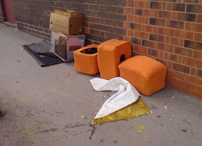
Some times people leave stuff outside for others to help themselves to when they have upgraded their own household goods. In fact you can almost see the newly unwrapped mattress or sofa (or table or bin or clock...) in a house next to the spot where the old model has been put out to dissappear. Or perhaps languish and degrade before becoming someone else's problem, leading to eventual removal by the invisible authorities. While I've been proccupied by (perishable) soft furnishings I spotted this group of orange stools, a pouffe-like group next to a couple of disgarded mats and a box that contained some new electronics. On closer inspection I realised that they are made from re-used plastic milk bottle crates with home made orange padded covers! I marvelled of the inventivness of this solution born of neccessity and lack of money and thought at the same time of who might be one step down in the food chain and see them as a lucky find.
Wednesday, 30 July 2008
Ebony, Ivory...
Of course anyone can print something on a bit of A4 and put it somewhere, coming over all official. Two contrasting examples follow. 'Wet Paint', its got a branded logo, text that tells us it's an 'approved partner' but it still looks dead scrappy and lame assed. Bad layout, primary message obscured by fixing method, faded photocopy, how can we respect this sign? 'Collection Care Seminar' appears to have all the wrong stuff going on. Dashed off in a minute, placed on an external door with blue tack, unprotected by a covering of any kind, any passer-by could have taken it down, or indeed, put it up. And yet it has authority, its crisp, legible and once again tells us that black capitals with no surrounding distractions are excellent communicators.
'Stop Scientology Moving to Moseley' posters appearred overnight all around a particular neighbourhood, comprehensively pasted onto grey street boxes and fences within an impressive radius. It is probably true to say that this isn't the work of a 'grown up' ex-stickerer, matured and employing the old techniques for a home grown propaganda war. We have that to look forward to, OAP taggers and wild style National Trust supporters. In fact looking at the example above we can imagine a parent and teenage child bonding side by side, one with a marker pen in hand, the other with a paste pot and handful of printouts, ahh! Whatever you think of Scientology, you've got to admire this spirited hijacking of urban artform methodology to spread this dissenting voice, a campaign that says to anyone 'if you feel strongly about something, get your message out there'. If you've got access to a word processor and a printer, or a photocopier, or even a black pen and and bit of paper, and of course the means to attach your sign, you are half way there.
To follow, postings on 'lost pet posters' and annoying 'no parking' signs, WATCH THIS SPACE...
Wednesday, 23 July 2008
the subliminal lightness of seeing
Now this one is about things left behind, absence and powerful communication through apparently quiet means. The first pic I took in this sequence was, I think, a trace of tape or ribbon that found its way as a kind of imprint onto a paver. Very subtle, but just unusual enough to catch the eye, a nice little twist.
Not long after and I spotted this example of a primtive tagger's daub emerging from within a classic, graphic combination of black and white chevrons. Perhaps a cleaning fluid revealled it's clean outline on a ground of fuzzy grey after the spray paint colour had been zapped? It has a hint of invisible ink about it, like time sensitive graffitti that emerges 24 hours after it has been applied. That would be cool!
Of course our corporate cousins are never far behind and the idea for cleaning a path through daily grime to miraculously give birth to a drinks promotion combines cynicism and genuine inventiveness. And then the ultimate form of ambient media employed by our local friendly multinational - a five metre wide billboard with, get this, writing so carefully toned you have to work your cute little eyeballs to find out its just a fecking car ad. Thanks for that! Whatever happend to world peace and save the whale? Get in on the act, quiet writing slips into the unconcious and leaves a little message behind, remember, guns don't kill people, people do, or something...
Sunday, 1 June 2008
When a dribble turns into a torrent
Now I'm in a dilemma. I don't condone mindless doodling 'out there' - mostly on aesthetic grounds. The continuous lines you must have seen left by dragging a marker or spray across can along every surface the perpetrator (or should I say participant?) walks past seem even more stupid than concentratrations of rubbish tags. But when someone brings the gift of a well placed colour into the harsh urban environment we usually have to thank them. This yellow punctuation started out wanting to obliterate the lettering on this sign, quickly gave that idea up and only just made it to the end of the text. But those dribbles that nearly break the frame are tantalising and the one that escapes the black border brings us back into the real world and gently invades our space.
Surprising colour, applied so that it manages to maneuver between spatial dimensions is the subject of this posting. I loved this baby blue, thickly spilt splodge with it's textured rice pudding skin. Destined to be around for a while judging by the quantity of paint, it immediately suggests an accidental spillage rather than a purposeful placement. And then the little dollop that has hit the vertical wall and been forced by gravity to head down south makes itself known. Nestling in amongst the streetwise lichen rings, it adds a spatial quality that confounds expectation. How did this come to be? The normal order of such things is to run down and collect underneath, but it almost looks like this escapee started in a pool on the ground and leapt out in a bid for freedom, not quite clearing the bounday wall.
After those modest examples comes a rather grander attempt to escape the frame. Over blocks of grey and white on hoardings is a splattering that is crazed and accompanied by the congealed pool of paint underneath it that seems nothing less than murderous. Starting from a more comfortable distance on the wall, it leaps out and is suddenly almost underfoot, pulling us into a desperate world. Perhaps the red itself, so liberally distributed, was to block out anther's text? And over the top one more layer, a silvery grey cloud lingers, telling us this is unfinished business. Walk on, don't get involved...
Labels:
doodling,
murderous,
streetwise,
surprising colour
Wednesday, 9 April 2008
DON'T...believe the hype
Ok folks, prepare for something totally different. A Wandering Mind stumbles on a quiet scoop at the forefront of urban trends reporting. Some newly emerging street style phenomena are documented and presented for your viewing pleasure. Check this out...
First of this lovely set of three is the metallic ivy, took me straight back to little school and home made Christmas decorations made proper with a unifying coat of the magical aerosol. At that time it was controlled by the responsible adult. Now it has been liberated and this is the result. It's way more sophistacted than tagging a tree, this is spray can art gone botanical, nature and mankind waging an unwinnable war, etc.
Next up is a bit of canalside graphic action. New bricks and mortar frame a stubby barge post (if that is what they are called?), dashed on it's fresh white top is a dual colour, criss-cross effect two second gesture. It seems to mean something. Blurs the boundary between official 'marking out' and unofficial 'pissing post'. It references a kind of funky burberry. Maybe. Have you seen one of these? Probably Not. New Trend, oh yes.
The winner by a nose, in this little trio of surprising mark making, is this example of graff on glass, how glamorous! Better still it's a car wash so it is enhanced by a modest light show and misty watery effects on a regular basis. Wonderful calligraphic quality, deceptive spatial game playing, exciting use of colour. But 'Moans', though? Is that a cool street name? Its like the influence of those 'grumpy old man' programmes on tv has filtered down to the hood.
Anyway, just remember you heard it here first, yeah? Plant paintin', post toppin' and car wash crashin' Oh yes.
Labels:
barge post,
graff on glass,
grumpy old man,
metallic ivy,
unwinnable war
Primary plaques plentiful and pleasureable
On a little stroll I saw these coloured squares all within a few hundred yards of each other. Thought they were great. I expected to keep seeing them, like a rainbow treasure hunt, but I think I must have made a wrong turning as I saw no more of these geometric insertions that day. If everybody just added one brightly coloured square to their neighbourhood, just think of the volume of enjoyment that act could perpetrate?
Thursday, 28 February 2008
Invasion
Caught sight of this nestled 'space invader' and after having read about the artist was buzzed to see one first hand. And those who are aware of my mosaicial tendencies will understand that I regard the confluence of this ancient art form with a contemporary graffitti aesthetic as a wonderful thing. It turns out that Invader, as the clandestine originator is known, also sells DIY kits. So maybe its not an original, found as it was on a college campus that figures, but does it even matter?
Colour me good
Strolling along this morning and saw these little multi-coloured dribbles of paint. Not sure how they came to be here but they add a little bit of paintery interest and of course the classic combination of organic forms and straight lines immediately start to suggest ideas about balance and composition. So you can imagine my surprise when casting my eyes 'back and to the left' of this scene an interior wall was revealled by the demolition on a freshly cleared site, now left as waste ground.
It is always fascinating when the domestic inside of buildings spill out, often witnessed in the media during natural disasters. This dramatic black paint splatter remains ambiguous as to whether it was lived with before, or appeared after the walls were peeled back. Next door to it a charming red rectangle, peeling away in sympathy with the layers below it, prompts thoughts about how it came to be, if not applied by an Russian constructivist. The field it floats on has a wonderfully sublte tonal history and the second rectangle in the bottom right hand corner balances the whole richly detailed surface.
The encounter put a smile on my face and convinced me that we benefit from such touches of colour and painterly applications that become part of our experience of the urban landscape and which seem belong and add depth and variety - rather than detract from their setting.
Labels:
add depth,
dribbles,
paint splatter,
urban landscape,
waste ground
Wednesday, 27 February 2008
What's my number?
Our begrudging love affair with numbers seems to grow as our literary pretentions decline, at least that is the argument I am illustrating with this card I found in a news agents the other day. It's all about the numbers, with just a few words inserted to join them up. The big question is does it work? Can we sit three angry men down on it and watch as a calm descends? And what colour is it? Probably rainbow. Wow! Never seen one of them before.
I'm likin' 112 Unit 6 particularly for it's home made, improvised feel. It's bespoke yet fails to display ideally in the alloted space, but I don't think that interferes with it doing its job, it will probably last years. I think we have another writing/number dichotomy going on though. The text is done very nicely and sits well, computer style font in a handmade stylee. And while the colour palette has its own logic the numbers are simply not pleasing and badly executed.
And at the top, this is how it shoulde be done. Or is it? It is Number 1 in so many ways, clear, crisp, unambiguous and very, very functional. Ok, it lacks character but look closely and there is still something funny going on here, seems somehow wonky and ultimately unsatisfying. The search continues for a perfectly harmonious letter/figure love-in.
Letter writing no dying art
Been finding some lovely semi-official looking text entries lately. The mysterious siino.cl.co remains an enigma, neatly anchoring a freshly painted alley that features a creme top with brick pattern and smart black skirt. My fanciful idea is it's a calling card for the firm of decorators who've done the job and they are diggin' the urban vernacular stencil aesthetic. Not sure, bit obscure.
Sitting in a freshly scrubbed patch on a vibrant purple wall WALEX screams out at us. But can this really be an ambient media campaign for the sanitary ware producers? That is stretching even my vivid imagination. Vivid it is though and 10 out of 10 for the colour combo, whoever you are.
Cheap (and nasty) caught my eye for it's noisy pixellated blur round the lettering (barely visible here unfortunately). Intentional, careless scaling or happy accident that sparks a new trend in corporate design, we are yet to see. As each of the groups of lettering were buzzed by the equivalent of Pig Pen's dusty fly-ridden halo I was sucked in by the simple use of shocking pink and fuzzy edges.
And so say brother Nathan...
Friday, 1 February 2008
It was a very Bad Day for Umbrellas
Jesus!!! In the space of a twenty minute walk I saw them piled up like turnips at the market, so many dead and dying brolleys scatered around the place there should have been a spooky mist and the occasional thud of distant heavy artillery. Ok, as usual I exagerate but there were definately more than usual, make no mistake it was windy, oh yes. But you're gonna know, arent you, on a very windy day, well my old brolleys gonna get torn to pieces, probably better not use it??!! Ok, these unlucky examples skipped the level one risk assessment and gave way to the contemporary trend of 'if it's broke don't fix it chuck it and go pound shop dont give a fockism'.
So in reverse order, also ran no 4 - City brolley, all sins are the same under the cloak of universal black, could be anyones, almost bin bag like, my hairs gonna be messed up for my meeting at 10, I work in the financial, quarter flung down in disgust with it's tentacles trailing, just another statistic.
Coming in at no. 3, found it in the hall of my shared house, probably no-ones if you accept the moral collective ownership of free gift, value-less easy come, easy go goodbye brolley-ist philoshophy. This failed spectacularly and was flung down without a second thought, it's stem seemed sturdy, its fate sealed by a stong gust.
No. 2 has got fighting spirit, down but not out. Striving to find a way out of this hell hole Corporation bin and, hope upon hope, be rescued by a 'nothing wrong with that, found it in a bin, lasted me for years' type citizen. It's pure invitation is almost propositional, pull my handle and I'm yours it seems to be saying. Nearly a winner.
Not to be outdone on this occasion is the pure and simple classic, landed from a great height (could have been outer space judging by the devasation and the 'splatter pattern' of this unfortunate) red and white, given up all hope. Looks very Chinese Shipping Container, cheap as you like, cracker quality. It is devastated, grandad couldn't take this to his shed and fix it up and make it as good as knew. It wasn't good when it was new. Its fucked to pieces. Its flung down like a WWF loser at the end of the show, it's a flat chested wet t-shirt with a wonky shaft, say no more.
Subscribe to:
Posts (Atom)